Logo Wordmark
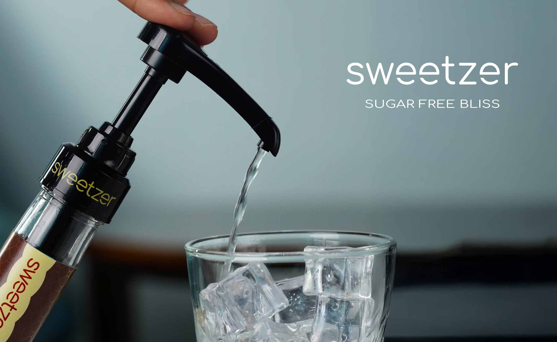
Word logotype for sweetener
Design Request
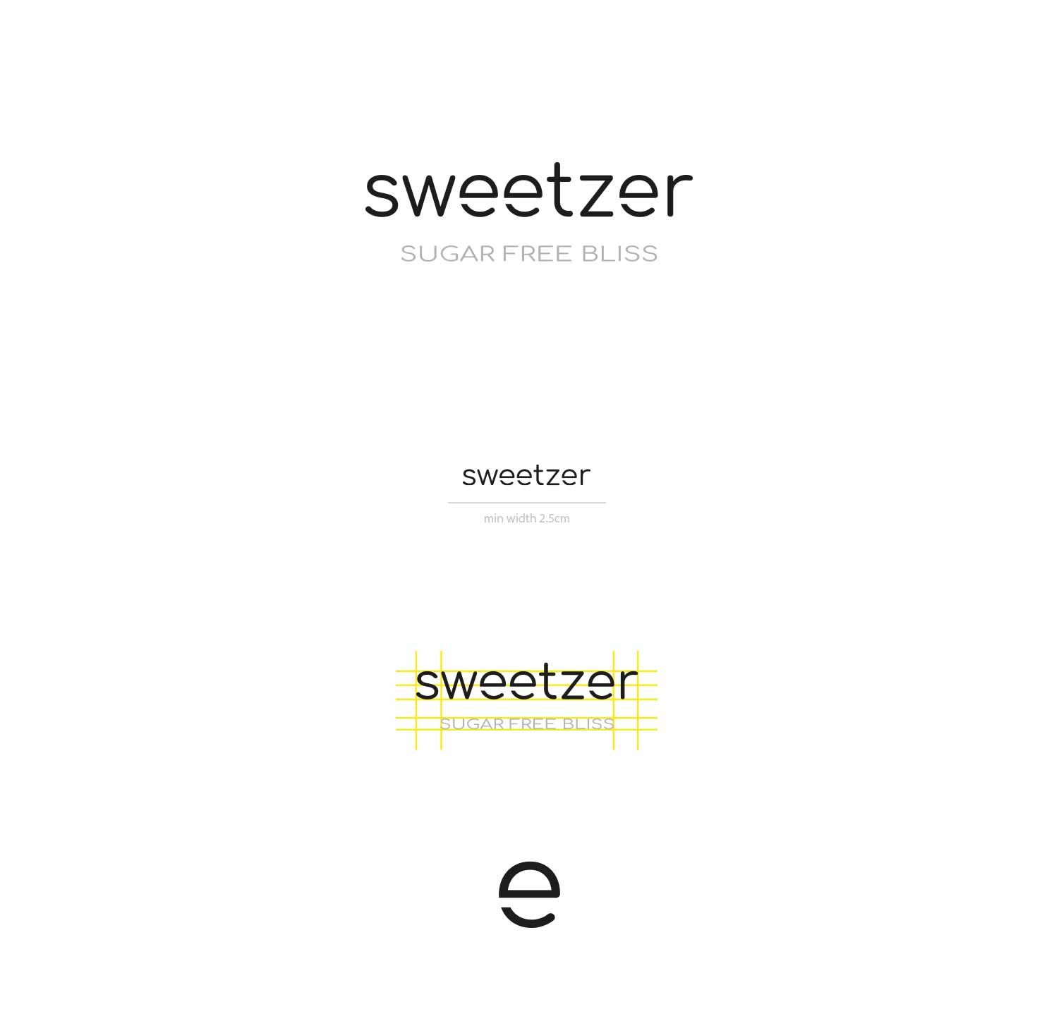
The request was to create a modern logo design (wordmark type) for a company that produces sugar-free sweetener. The Logo must be very simple, consisting of only one typeface. It must be immediate, understandable and very usable; for this reason too, it is important not to make it so simple as to appear anonymous or associated with similar brands.
Idea logo design
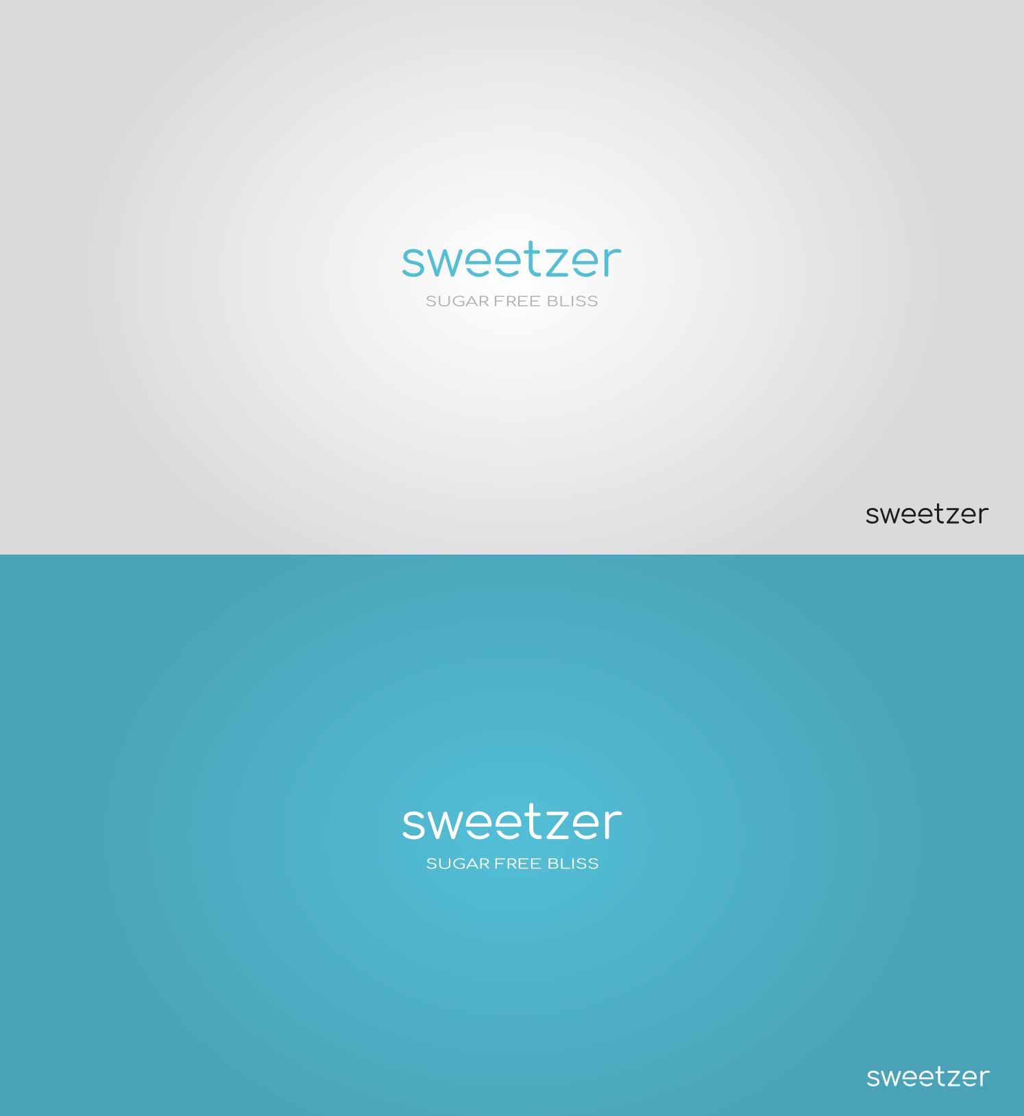
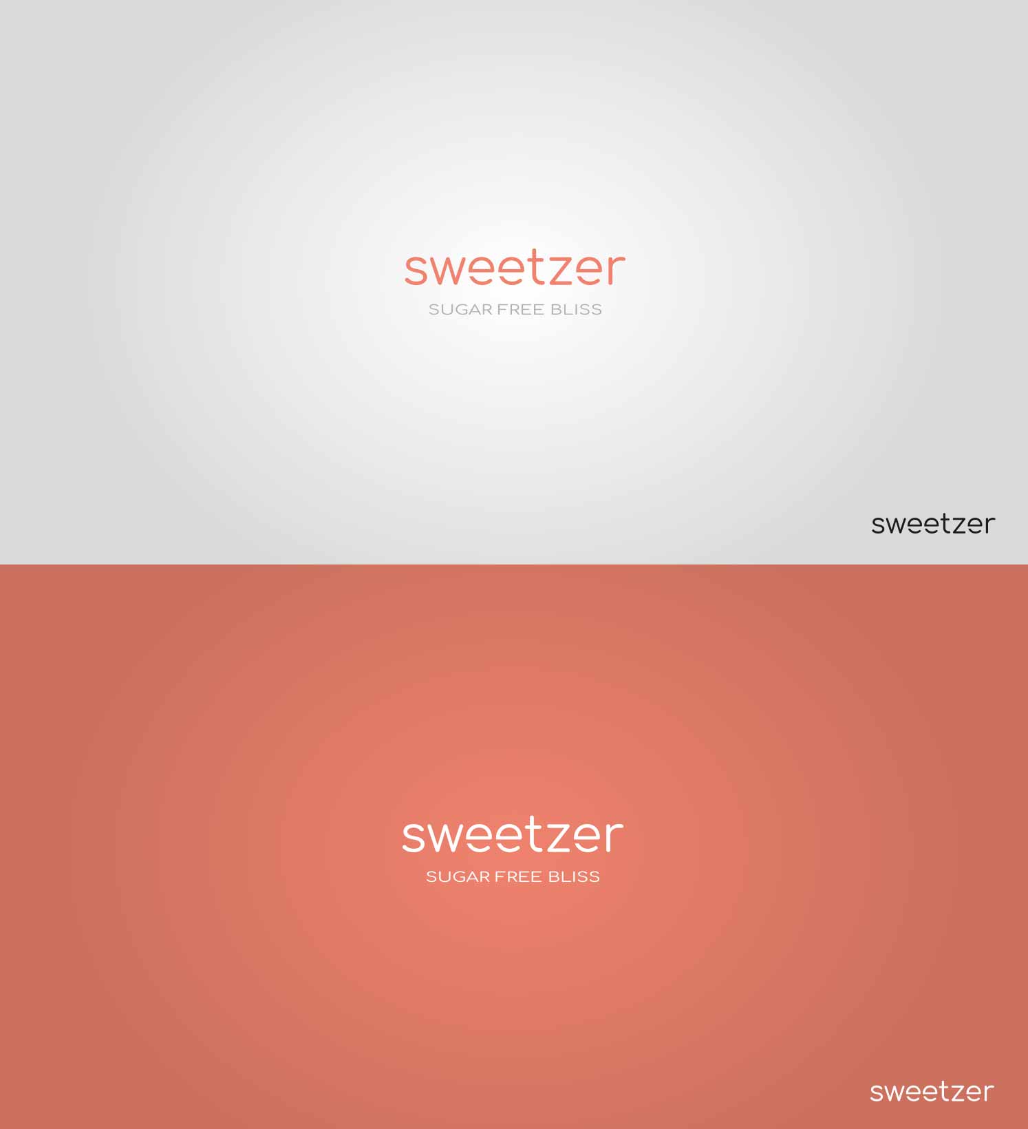
The logo format is a wordmark and since there is no icon, the letters “e” in the naming of the logo played a special role. They represent lightness, recognizability and give a modern and fun touch to the brand. The tagline “sugar free bliss” strengthens and identifies the sector well. Finally, the logo is shown on different backgrounds.
Activity
Wordmark logo design for sweetener company.
Locality
Malaysia.
Website
The main logo color can be black or white, or colored in different pastel shades.
| Logo Design Color CMYK | C63 M1 Y10 K0 | C0 M60 Y53 K0 | C38 M0 Y78 K0 |
Wordmark logo design
The logotype adapts very well to different pastel colored backgrounds balanced and in harmony. Designing a logo with different backgrounds and shades is essential to ensure its versatility and readability in any context.
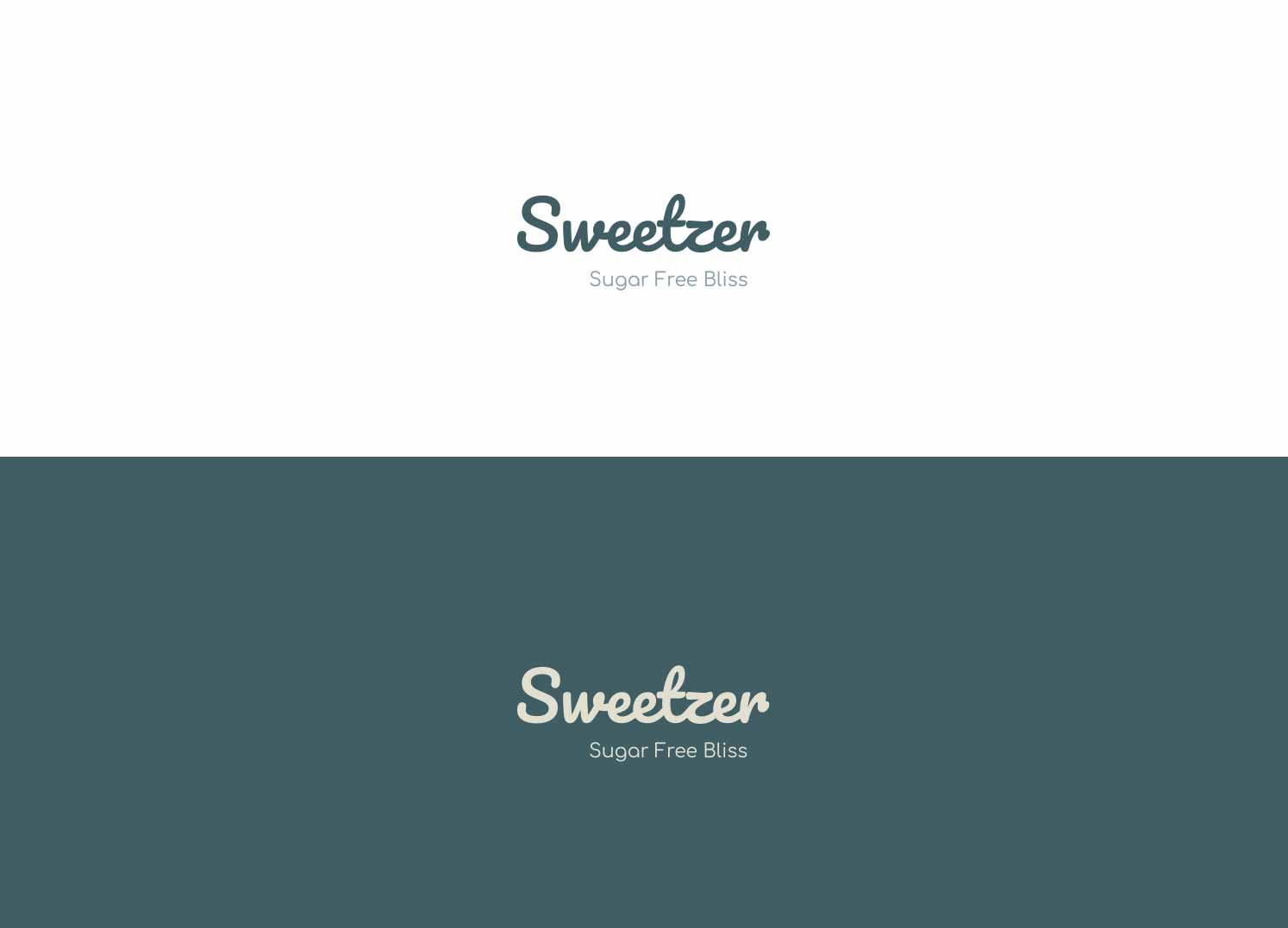
Alternative logo wordmark
The alternative logo variant features a different font, softened by the font type used and different colors.

