design brand initial letters
sharon russo
Client request
First of all the client input is very important, the client requested the design brand of the Sharon Russo, a monogram design formed by the initial letters “S” and “R”. The brand must represent a beauty center, but also be very personal, original and feminine. The beauty center’s treatments will be mainly concentrated on the face. Along with the design of the brand design, is requested to create other elements related to the identity, such as: letterhead, business card, gift card and the front-end design for the new website.
The idea to design this brand
The brand designed perfectly blends together the letter “S” (the initial of the name SHARON), and the letter “R” (the initial of the RUSSIAN surname) to become a single monogram representing a stylized woman’s head. Most of the beauty treatments that the activity will carry out will be mainly concentrated on the face, and that is why I considered the choice of referring to a woman’s face / head directly in the symbol.
The design brand is serious and professional, and its geometry makes it very modern. Another value that shines through in an important way is the cleanliness and precision, thanks to the well-defined and sharp geometric shapes.
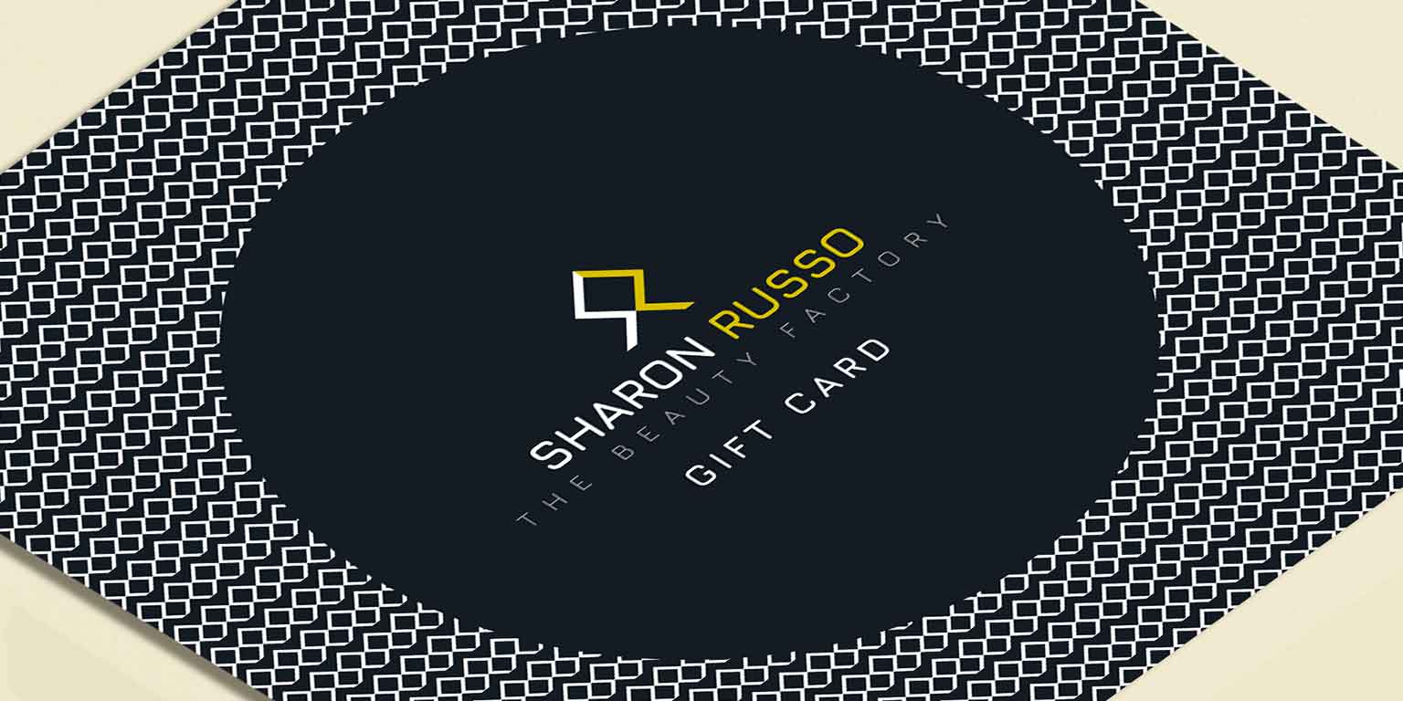
The alternation of white / black colors to identify the letter “S” and gold to identify the letter “R” make it easier to read the monogram. This particular tagline makes the business sector immediately clear, and has been specially put in a 50% gray to allow it to be read on both a white and black background.
A midnight blue is used, which goes well with the gold and white colors. The logo fits very well on both dark and light backgrounds.

Activities
Beauty center brand design, corporate brand identity design and printing material.
Località
Rome, Italy.
Sito web
| CMYK colors | 103 C | black 6 C | k 50 |


Surface design
The logo monogram design can also be used separately to create icons to be used for social networks. Another feature that makes the logo very usable in the future is the “surface pattern” of which an example is shown in the design of the gift card and business card.


Brand identity design
The design is presented on real materials, such as a business card, gift card and letterhead with a preview of a simple but professional design for the website.


Alternative brand design proposal
The alternative design variant shows an assembly of the letters “S” and “R” thanks to the use of very elegant, dynamic and undiscovered negative space. Different fonts and a less bright gold tone are also offered.