branding design
Brand creation for construction industry
Client request
This client’s request was to create a branding design for his business sector: design, construction and on-site installation of metal and glass elements and structures. The brand also had to be inspired by the Pulsar stars, it had to be original and unleash energy, but above all, it had to stand out from the competitors.
brand design idea
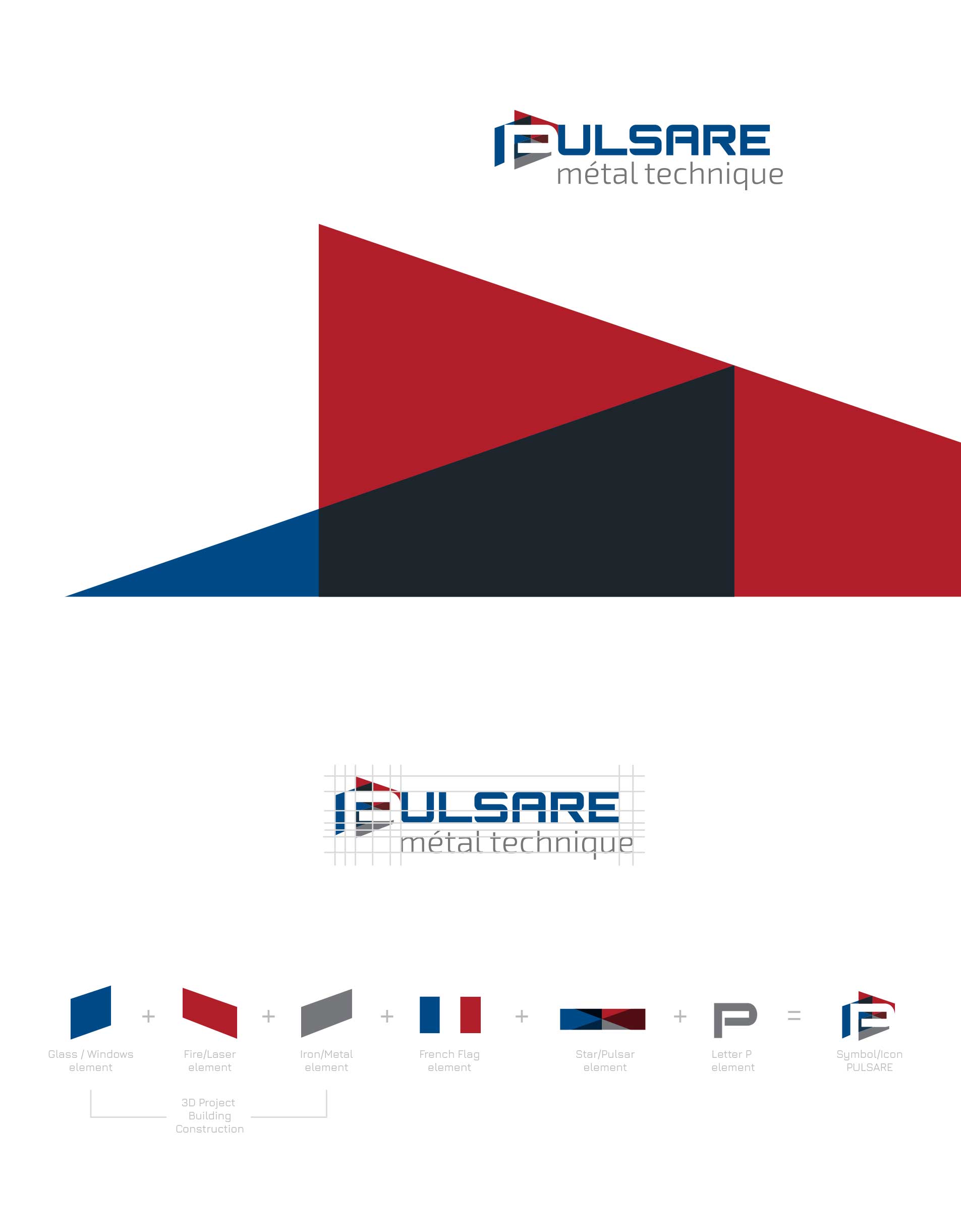
This logo perfectly blends the letter “P” (the initial of the company name PULSARE) and the business sector: design, construction and on-site installation of elements and structures in metal and glass. The symbol is made up of 3 parts that refer to various elements and colors (Blue, Red and Gray) and which, all together, give life to the complete symbol which has different meanings inside: the symbol of the building, the assembly of different panels and elements such as glass and metal, 3D technical design, the Pulsar star and the letter P.
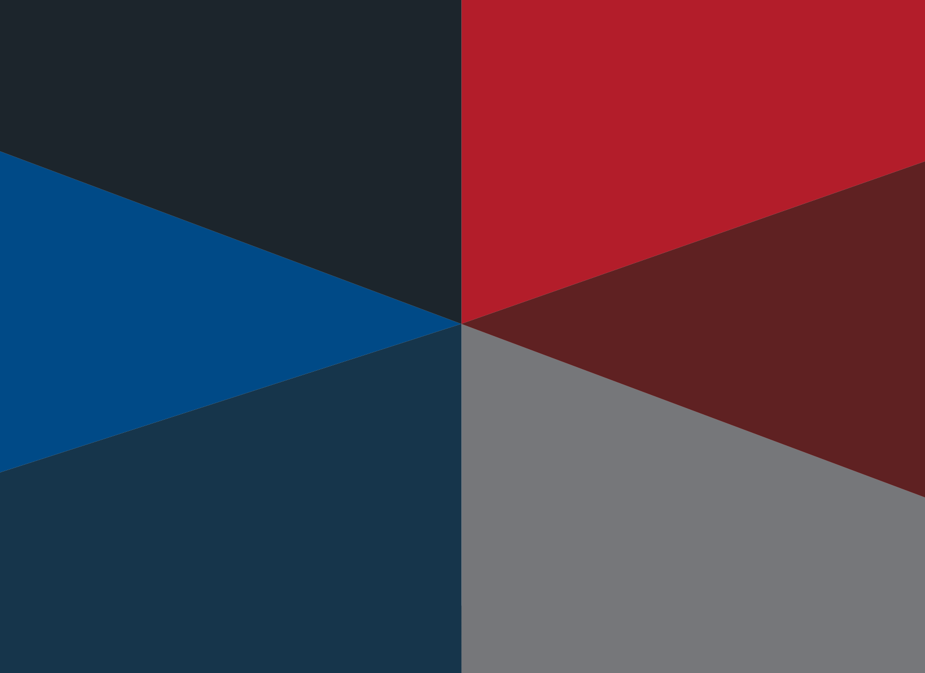
First of all the blue element represents the glass material, the red one represents the laser processing and the gray element symbolizes the metal.
These three components, taken together, also create the 3D design and assembly of the various processes and materials. In addition, the colors have a strong reference to the French flag, being the business located in France, and having the company aim to become one of the major national interpreters in this sector.
Activities
Modern branding design with printing materials.
Locality
Versailles, Île-de-France, France.
Website
| Pantone colors |
301 C | 7621 C | Gray 9 C | 443 C |
brand design
This brand is modern and professional and its geometry and type of font make it very technical.
Letter “P” is inserted above the 3 elements / panels, making use of the negative space while the rest of the name is positive. The symbol can also be used separately to create icons to be used for social networks.
Brand additional materials
Overlapping the 3 panels gives life to a symbol / reference to the Pulsar star, placed in the center of the letter P. This element can be separated from the logo to create autonomous backgrounds and graphics to reinforce the visual identity of the brand.
Branding
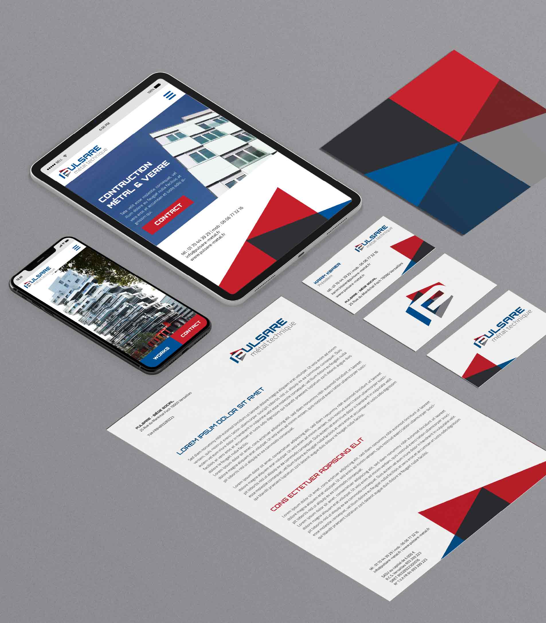
The brand is presented on real media, such as business card and letterhead, with a preview of professional solutions for the website.
Alternative brand proposal
The alternative branding design represents the letter “P”, the symbol of the building, the metal and a strong reference to the Pulsar star and the company name is presented with different styles and costum typeface.


